
 We always love to hear from you. Please do send in any comments or questions. Today I’d like to answer one such question:
“Jim, when you use stock charts and show them in your articles, I see a number of other lines that you say are the moving averages. What are those, and which ones should I use- I see that there are several to choose from.”
Regarding what a moving average is, Adam Woods explains it best from a recent interview:
Adam: There are several types of MA’s but for the purpose of this conversation lets focus on the most common MA which is a simple moving average. The most common definition is that: A simple moving average that is calculated by adding the closing price of the security for a number of time periods and then dividing this total by the number of time periods. But all this is calculated for you and appears as a fluctuating line on a stock price chart. The two most common are the 50 Day Moving Average (DMA) and the 200 DMA.The idea is to draw a line on a chart to help people clearly see the underlying trend: is the moving average sloping higher or lower? Where is the price of the stock in relation to the moving average? In a healthy market you typically see a stock trade above its ascending 50 dma line and its 50 dma is above its longer term 200 dma line. The opposite is true for a weak market. Many investors use the 50 dma line as a line in the sand-if the stock is above it they consider that healthy and vice versa. Please keep in ind this works for all capital markets: stocks, ETFs, the major averages, currencies and commodities.
Jim: And the 50 day moving average (50 DMA) or 200 day moving average (200 DMA) are the most common. And they are basically what the average price was over the last 50 or 200 days?
Adam: exactly, it smoothes out the data by drawing a line on the chart- if the line is ascending that’s healthy, if it is descending that’s not ideal.
So you can set up any chart on any stock or index with any moving average you want. Personally, I start off by using the 30 week moving average on the weekly chart. Here it is for Expedia (EXPE) currently:

Source: Stockcharts.com
As you can see, the 30 week line covers two years of data, and is great for getting a big picture view of what’s going on, and what’s likely to go on. Notice how, on the ascent, as long as the price stayed above the moving average, that the climb continued. Once the line broke though, things got shaky.
Now let’s zoom in by going to the daily chart, for a shorter time frame:
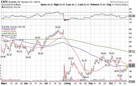
The green line is the equivalent of the 30 week moving average from the previous chart. The blue line is the closely-watched 50 day moving average (50dma), and the red line is the 21dma. The 21dma is a very good short term move indicator.
The untrained eye might look at this chart and think that EXPE was making a comeback from a beaten down position. And maybe it will, maybe it won’t, we can only ever give our most intelligent guess on principles that usually work.
But can you see how all the EXPE action is going on UNDER the 30week/150day moving average, the green line? And can you see which way that green line is pointing?
Stocks will rise and fall from day to day, but it’s important to go with the bigger picture flow of things.
And now I’ll draw some trend lines on that chart so you get a different perspective:

See how EXPE is stuck in a sideways channel, bouncing between $46 and $54? And you can see that these trend lines I just drew are having more of an impact on the price behavior than the moving average lines, on a short term basis.
So you can see that, using this example, EXPE has its work cut out. The big picture chart is pointing down, and there’s tough overhead resistance at $54.
Best,
Jim.


