
 The market finds itself in a rut, a holding pattern it seems. But it was also due for a healthy break after the run up since the falls of early August.
So let’s take a look at the big picture right now and where things might be headed next. We have 3 major stock indexes to look at for clues, and each one tells a different tale…
Sometimes I like to see what ‘Bollinger Bands’ are saying on a chart. Bollinger Bands are often a good way of seeing an overall trend as well as seeing if the market is at extremes within that trend. They form a kind of channel around the price to guide you.
First let’s look at the Nasdaq with Bollinger Bands either side of it (blue curvy lines):
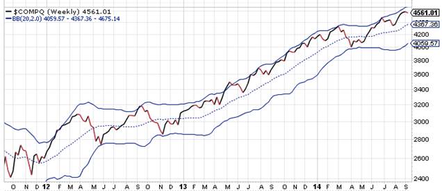
The Nasdaq is the best performer of the 3 major indexes, thanks to healthcare and technology stocks leading the way of this recent advance. A nasty dip in healthcare stocks in April receovered since. Nasdaq has broken to new highs and keeps flying. We can see though that it’s in the extreme of the band, but it was stay that way for a long time as we can see for most of 2013.
Next best, the S+P 500:

The trend is more solid here, and decidedly up. Notice how, unlike Nasdaq, S+P has stayed above the dashed center-line of the Bollinger Band? If any correction we get now stays above that center-line things are as on track as they’ve ever been. What we really need to see with S+P is for it to better the 2,008 level and set a new high. Meanwhile, it needs to hold above its 50-day moving price average of 1,972.
Last and definitely least is the stock index that could be the canary in the coalmine: Russell 2000 of smaller companies:
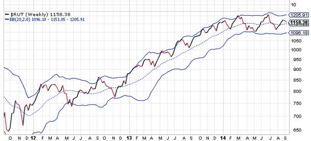
This trend is clearly sideways, as the Bollinger Bands show. The price is up and down around that dashed center line. This is the classic autumn phase, a transition from summer to winter, usually, winter being a bear market. As I’ve said before, this could be the cry of the bear in the distance, and if we see this chart break decidedly below 1,100 that cry will be sounding a lot louder.
The author has an interest in the securities discussed in this article. Source of charts: stockcharts.com
Note from editor: check your email to see if you received a limited time invitation to Stock Code Breaker.


